Almost every week I log into my Capital One 360 account to make several transfers from another bank into various 360 Savings accounts. I can’t automate this process because, being a freelancer, my income varies each week and I am transferring based on percentages - not standard dollar amounts. It is a small repetitive administrative task that I am used to performing. So, perhaps you can imagine my chagrin when I recently logged-in for my transfers and found a disturbingly different website greeting me.
I’m not a designer, but I have been doing web development since the invention of HTML, so I have watched all the evolving trends of web design. Something I’ve noticed recently has been the effect of mobile device usage on web application design – perhaps to the benefit of phone users – but often to the detriment of desktop/laptop computer users.
The most recent – and personally frustrating example – is the design change of the Capital One 360 banking web application. In case you aren’t familiar, in 2012 Capital One bought ING Direct USA – one of the first online-only banks with (at the time) much more generous interest rates on basic Savings accounts. At the time of the purchase, Capital One just updated the colors used on the award-winning ING Direct site design to match their red and blue branding. My husband and I had set up accounts with ING in 2004, so for 14 years we were able to enjoy our online banking experience.
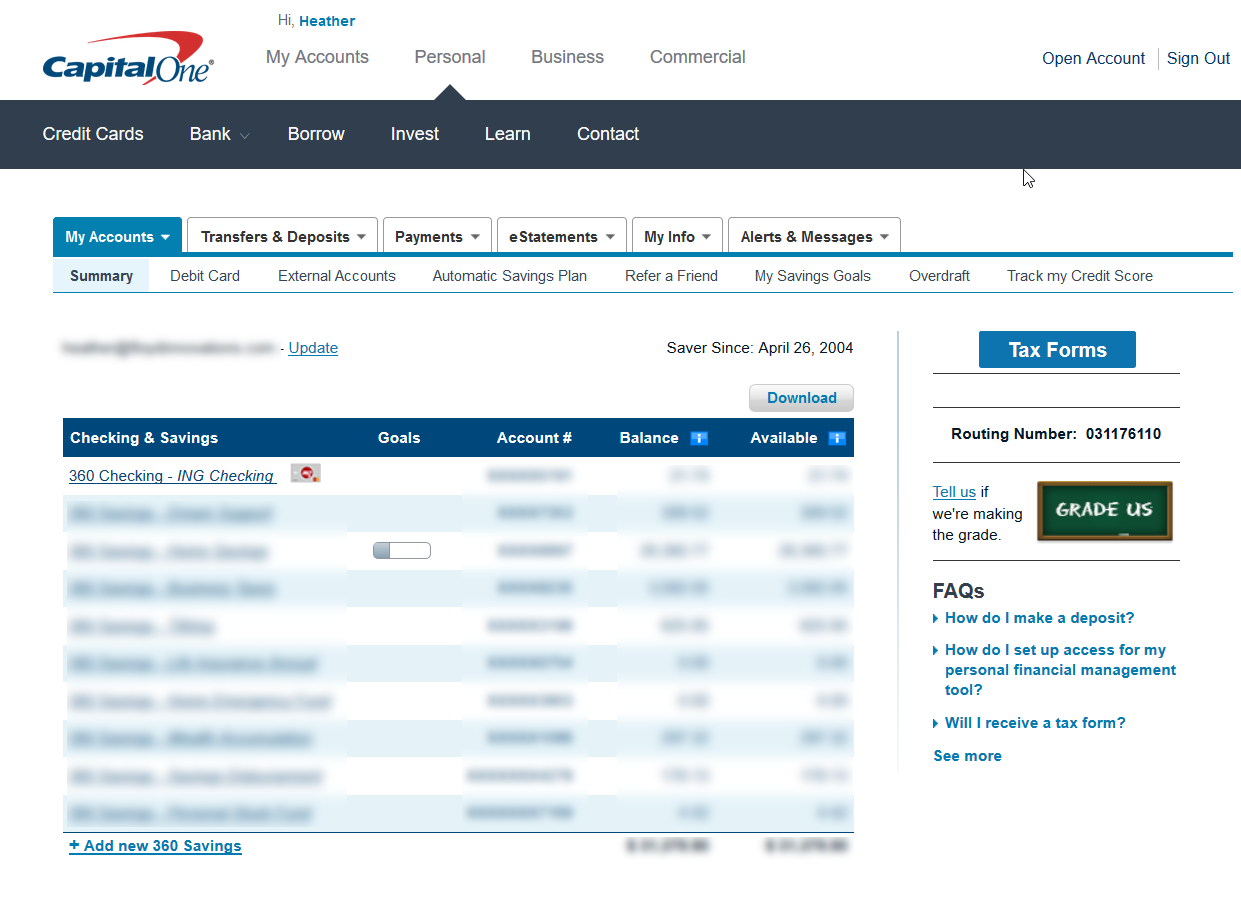
What made the original design so user-friendly? The main “account summary” page had a simple, easily scannable table of all ten of my accounts – with their “nicknames”, account numbers, and balances – even a nice little total at the bottom. Any operation I might want to perform – transferring money, viewing statements, opening a new account were at my fingertips.
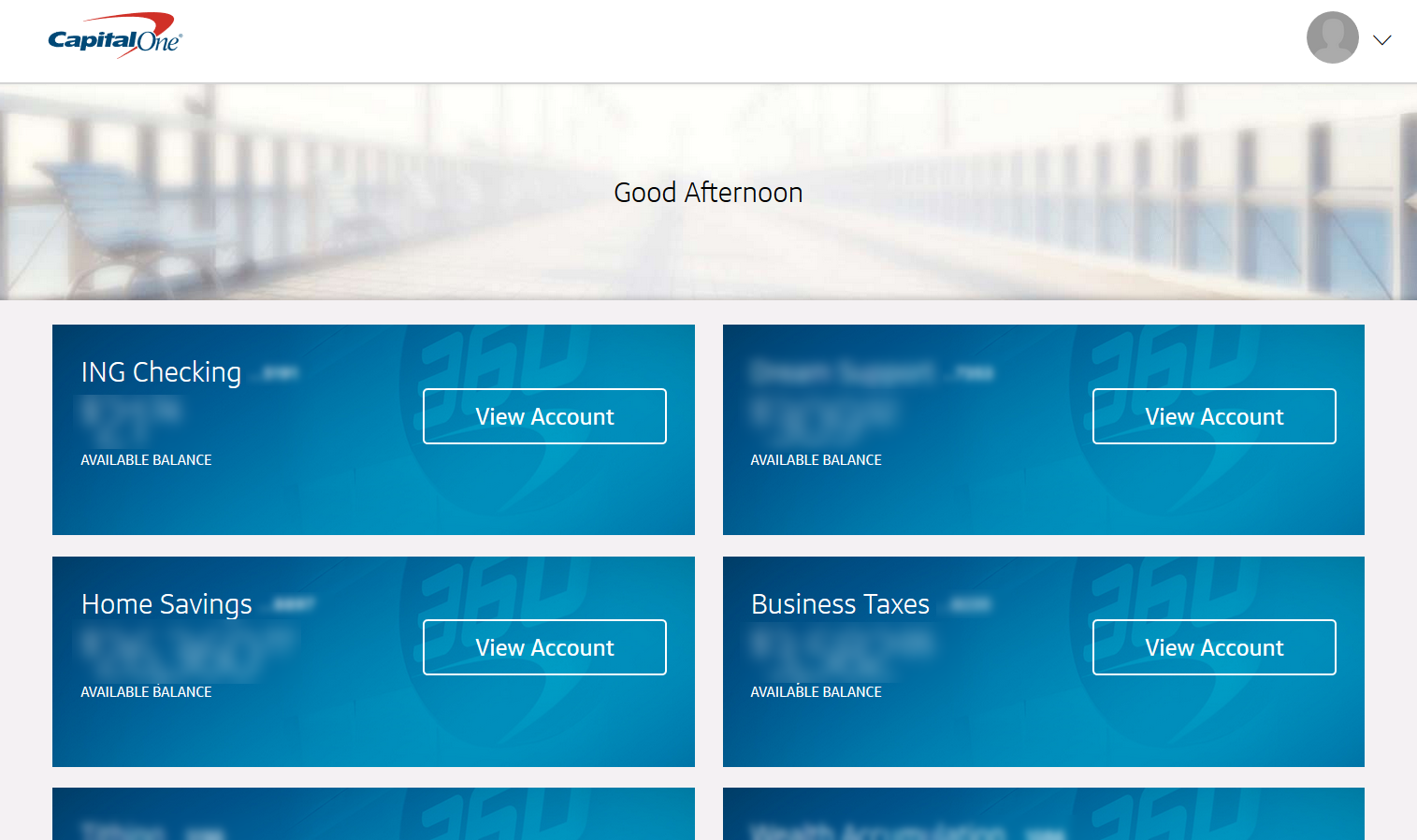
The new design – when viewed on my 1920 x 1080 monitor displays only 4 of my accounts, with a quarter of the screen taken up with an extremely useless “Good Afternoon” message. I can’t do anything until I click into a specific account. In general, any operation using the new design takes more clicks to achieve.
Capital One touts its new design as giving users “a more consistent look and feel across all your devices” which may be true – but is it really a good user experience?
Sure, if I were using my phone to check my accounts, those big fat boxes would be easy to read, and those big buttons easy to touch, but I purposely choose to use my large monitor and keyboard to take care of certain online tasks. Why should I have to suffer with a mobile-oriented interface when I do?
“Mobile-first” design is a buzzword in modern website design, and in an increasingly mobile world, considering how your designs will look and function on different screen sizes makes sense, but I think it’s important not to get carried away with the latest design trends without having an understanding of how YOUR specific customers/site visitors are using your website. Your analytics can give you some clues about what devices and screen-sizes your visitors are utilizing. Also, pay attention to what pages are being viewed and tasks are being completed most frequently. Any redesigns should make it faster and easier to reach that content – not more difficult.
What redesigns have you seen lately that have made it harder to use a website rather than easier?